
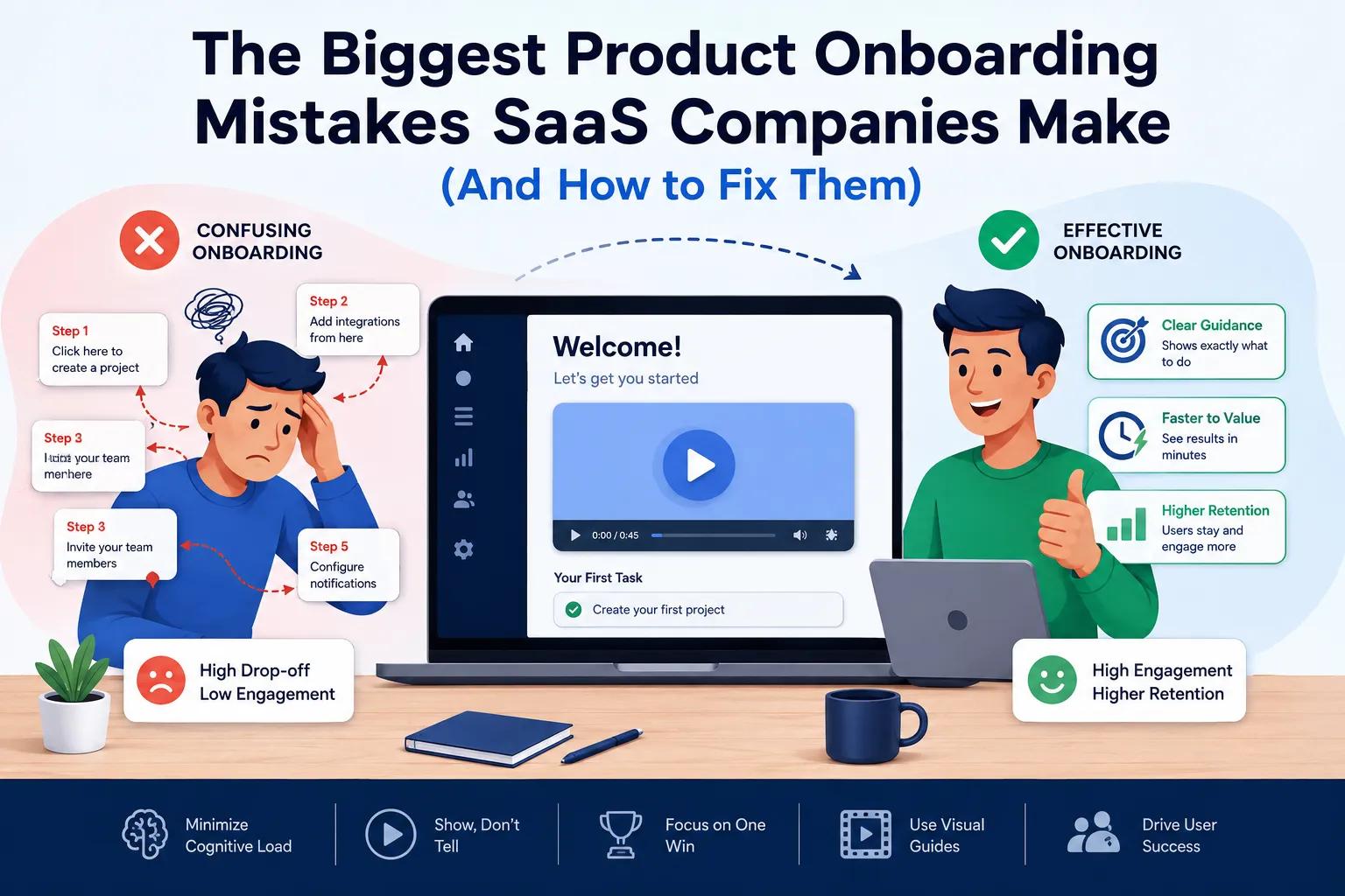
The Biggest Product Onboarding Mistakes SaaS Companies Make (And How to Fix Them)
You have poured months of code, sweat, and capital into building an incredible SaaS product. Your marketing team successfully drives sign-ups, but then something frustrating happens: a massive chunk of those trial users disappear after their very first login. They never come back.
This is the hidden leaking bucket of the software world, and it usually boils down to a flawed user introduction. If you are wondering how to stop losing users during their first few minutes inside your platform, you are in the right place. In this article, you will learn the exact friction points that drive users away and discover how a targeted SaaS product demo video can fundamentally shift your retention numbers.
The Quick Fix for Broken Onboarding
How do you fix a high churn rate during user onboarding?
The fastest way to fix a broken onboarding experience is to replace text-dense tutorial pop-ups with short, engaging visual guides that lead users to their "Aha!" moment—the exact instant they realize your software solves their problem—in under 60 seconds.
Minimize Cognitive Load: Stop forcing new users to read pages of documentation before they can use your platform.
Show, Don't Tell: Use a clear SaaS product demo video on the initial dashboard to demonstrate the primary workflow.
Focus on One Win: Guide the user to complete just one meaningful task during their first session instead of showing them every single feature.
Top Product Onboarding Pitfalls in Software
1. The "All-at-Once" Feature Dump
The most frequent mistake product teams make is treating the first login like a comprehensive training seminar. When a user is hit with ten consecutive tooltips pointing at every button on the screen, they experience cognitive overload. They did not sign up to learn your interface; they signed up to get a specific job done.
2. Delaying the Time-to-Value (TTV)
Time-to-Value is the clock that starts ticking the moment a user signs up. If your platform requires complex API configurations, massive data uploads, or lengthy team invitations before delivering any visible benefit, users will lose interest. You need to provide a micro-win early in the process.
3. Ignoring Diverse Learning Styles
Some users like to click around and figure things out organically. Others want a guided path. Relying entirely on long-form knowledge base articles completely alienates the large percentage of professionals who process information visually.
Visual Content vs. Text-Heavy In-App Tours
When you guide a user through a new interface, the medium you choose dictates how much information they actually retain. Let's look at how traditional text methods stack up against modern visual communication:
Onboarding Element | Text-Heavy Tooltips & Guides | Animated Explainer / Demo Video |
User Engagement | Low; users frequently click "Skip All" | High; visual movement holds attention |
Time to Comprehension | Slow; requires reading and mental mapping | Fast; shows the exact click path instantly |
Emotional Connection | Neutral or clinical | High; builds excitement about the product |
Retention of Steps | Poor; easily forgotten after closing the popup | Strong; audio-visual pairing aids memory |
By integrating clean motion graphics or a structured product walkthrough right into your welcome screen, you bridge the gap between confusion and clarity. Instead of reading about your features, your users see them in action.
Common Mistakes to Avoid
When SaaS teams try to optimize their user setup experience, they often fall into a few common traps:
Overcomplicating the First Step: Forcing users to complete a 10-step profile setup before they can even see the main dashboard. Keep the barrier to entry as low as possible.
Using Robotic Voiceovers: If you use video assets in your onboarding, avoid cheap text-to-speech tools. A cold, synthetic voice makes your software feel unpolished and untrustworthy.
Omitting the Next Clear Action: Ending a welcome guide without explicitly telling the user what to click next leaves them stranded on an empty dashboard.
Best Practices
To turn your onboarding sequence into a high-retention engine, implement these proven strategies:
Map the Shortest Path to Success: Identify the absolute minimum number of clicks required for a user to get value from your app, and ruthlessly eliminate any steps that get in the way.
Use Video Contextually: Place short, 30-second explainer videos right inside specific, complex modules rather than just having one video at the very start.
Partner with Professionals: If you want your platform to command premium pricing, your onboarding assets must look pristine. Working with a dedicated studio ensures your product looks as polished, sleek, and intuitive as possible.
At Animated Explainers, we specialize in translating complex software workflows into crystal-clear, engaging visual narratives. Whether you need high-end 2D animation to explain your software's core concepts or precise video editing for your in-app walkthroughs, our team crafts assets tailored to boost your user activation rates.
About Our Firm
Business Name: Animated Explainers
Address: 100 West Road, Suite 300 #351 Towson, MD 21204, USA
Email: [email protected]
Website: https://www.animatedexplainers.com/
If you are ready to stop losing trial users to confusing onboarding workflows, check out our pricing page or head over to our portfolio to see how we have helped other software platforms simplify their user experience. Let's chat—reach out to us via our contact us page today.
Frequently Asked Questions
1. How long should an onboarding video be?
Keep it under 60 to 90 seconds. New users have short attention spans and want to start using the software themselves, so give them a high-level overview quickly.
2. Can we use these videos for sales as well?
Yes. A great onboarding video often pulls double duty as a promotional video or asset on your marketing site because it clearly demonstrates how easy your product is to use.
3. Should we show the actual software UI or abstract animations?
A mix of both works best. Use motion graphics to explain the big-picture concepts, and then show simplified versions of your user interface to guide users through exact button clicks.
4. What is the difference between a product demo and an explainer video?
An explainer video typically focuses on the problem and the high-level solution, whereas a product demo goes deeper into the actual features, interface, and workflow mechanics.
5. How do we know if our onboarding videos are working?
Track your user activation metrics. Look for a decrease in drop-off rates on the specific pages or steps where the video is embedded, alongside a reduction in basic support tickets.