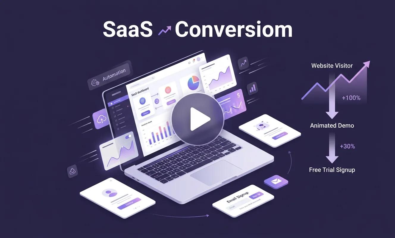
Most SaaS landing pages ask a visitor to trust a screenshot and a headline before they'll hand over an email address. That's a small ask that fails constantly. A demo animation removes the guesswork by showing exactly what the product does, in motion, before anyone commits to a signup form.
This matters more than most marketing teams assume. A visitor who can't picture how a tool fits into their workday won't start a trial, no matter how good the copy is. Animated product demos close that gap, and the data on trial signups backs it up. Here's what actually moves the needle, where teams get it wrong, and how to plan a demo that earns its place on the page.
Why Visitors Hesitate Before Starting a Free Trial
A free trial signup feels low-risk on paper, but it still asks for time. The visitor has to imagine setting up an account, learning an interface, and figuring out if the product solves their specific problem. Static screenshots and long feature lists don't answer that question fast enough.
Recent industry data shows how big this gap has become. According to the ChartMogul 2026 SaaS Conversion Report, which analyzed 200 B2B software products, the median free-to-paid conversion rate sits at just 8%, and the distribution is bimodal: roughly a fifth of products convert below 2.5%, while another chunk convert above 25%. Very few sit anywhere near the average. The teams landing in that top group tend to share one thing: a trial experience that shows value almost immediately.
A well-made demo video does that work before the trial even starts. It shortens the distance between "what does this software do" and "I want to try this myself."
What Makes an Animated Demo Different From a Screen Recording
A screen recording shows the product as it is. An animated demo shows the product the way a user experiences it at its best — clean data, a clear workflow, no lag, no clutter, and no distracting UI elements that don't matter to a first-time visitor.
This distinction matters for SaaS products with complex backends, dashboards, or workflows that are hard to capture cleanly on camera. Animation lets a studio simplify a multi-step process into 30 to 60 seconds, highlight the exact features that drive activation, and cut anything that would confuse a first-time viewer.
It also solves a practical problem: many SaaS products look unfinished or buggy in a raw screen capture simply because real data is messy. Animation sidesteps that entirely.
What the Data Says About Demo Videos and Signups
Video's impact on SaaS conversion isn't a hunch, and it isn't small. Industry research points in a consistent direction:
● A 2026 report from PC Tech Magazine found that 73% of SaaS homepages still don't feature a product video at all, despite the documented lift video provides — a gap most competitors haven't closed yet.
● A joint SEMrush and Hotjar study covering 38 million organic visitor sessions across 510 SaaS websites found that homepages with an embedded, interactive product walkthrough saw meaningfully higher freemium signup rates than static marketing pages.
● Arcade's 2026 review of interactive demo placements cites customers who saw substantial onboarding conversion gains after replacing a static welcome page with an embedded product walkthrough at the activation step.
The pattern across this research is the same: showing the product in motion, early in the funnel, consistently outperforms describing it in text.
Quick Answer: Where Should a Demo Video Go?
For the fastest lift in signups, place a short animated demo in three spots: above the fold on the homepage, on the pricing page next to the CTA, and inside the trial's first onboarding screen. Keep each version under 90 seconds, since engagement drops sharply after the two-minute mark.
Placement | Goal | Ideal Length |
Homepage hero | Explain what the product does in one glance | 15–30 seconds |
Pricing page | Reduce hesitation right before signup | 30–60 seconds |
Trial onboarding | Get the user to their first "aha" moment fast | Under 90 seconds |
Common Mistakes SaaS Teams Make With Demo Videos
● Trying to show every feature instead of the two or three that drive activation.
● Skipping a single, clear call to action at the end of the video.
● Using outdated UI footage that no longer matches the live product.
● Making the video too long — engagement drops off fast after the first minute.
● Treating the demo as a one-time asset instead of updating it as the product evolves.
A Simple Framework for Planning Your Own Demo
1. Pick one user goal. Choose the single outcome a new user cares about most, and build the whole demo around reaching it.
2. Script the journey, not the feature list. Walk through the steps a real user takes, in order, from problem to result.
3. Simplify the visuals. Strip out anything — menus, settings, secondary data — that isn't part of the core story.
4. End on one action. Close with a single, specific next step: start a trial, book a call, or try a feature.
5. Test placement before length. Where the video sits on the page usually matters more than shaving off a few seconds.
Choosing a Studio to Produce It
Once a team decides to build a demo, the next question is usually who should make it. Motion graphics work well for dashboards, analytics tools, and workflow software, since flat, clean animation matches how most SaaS interfaces already look. Full 3D animation services make more sense for products with a physical or spatial component — logistics platforms, IoT dashboards, or hardware-adjacent tools — where depth and camera movement help a viewer understand how pieces fit together.
SaaS companies increasingly look outside their home city for this work, since the production doesn't require the studio to be local. That said, hubs with a growing tech and animation presence, such as Houston, have seen more studios take on this kind of project, including teams offering 3D animation in Houston that work remotely with SaaS clients across the country. What matters more than location is a portfolio that shows software explainer work specifically, not just product commercials or entertainment reels.
Best Practices Before You Brief a Studio
● Bring a rough script or outline, even an imperfect one — it saves revision rounds later.
● Share real usage data or a demo account so the animation reflects the actual product.
● Decide on placement and length before production starts, not after.
● Plan for at least one update cycle as the product's UI changes.
Conclusion
Free trial signups rise when the distance between curiosity and confidence shrinks, and a well-placed animated demo is one of the most reliable ways to shrink it. It won't fix a weak product or a confusing onboarding flow, but for a SaaS team that already has something worth trying, it removes the single biggest reason a visitor leaves without signing up: not knowing what they'd actually be getting.
Start small. One clear demo, placed where hesitation is highest, will tell you more about its impact than a full video overhaul ever will.